As part of a UX design class, my classmate Ophélie and I had to conduct a UX audit and do a redesign of the Oceanographic Museum of Monaco's website. (original website )
Role : UX/UI audit, reorganization of information, graphic charter, UI design
UX audit and UI analysis
We started by analyzing the structure of the website, and we identified its problems (cognitive overload, graphical inconsistencies, illogical user paths, etc). We had to present our diagnostic to our teachers as if they were the clients, and explain to them why their website was not user friendly.
Proto-persona and reorganization of information
We also created a proto-persona and we based our user paths on her needs. We also improved the information architecture with card sorting.
Our solution
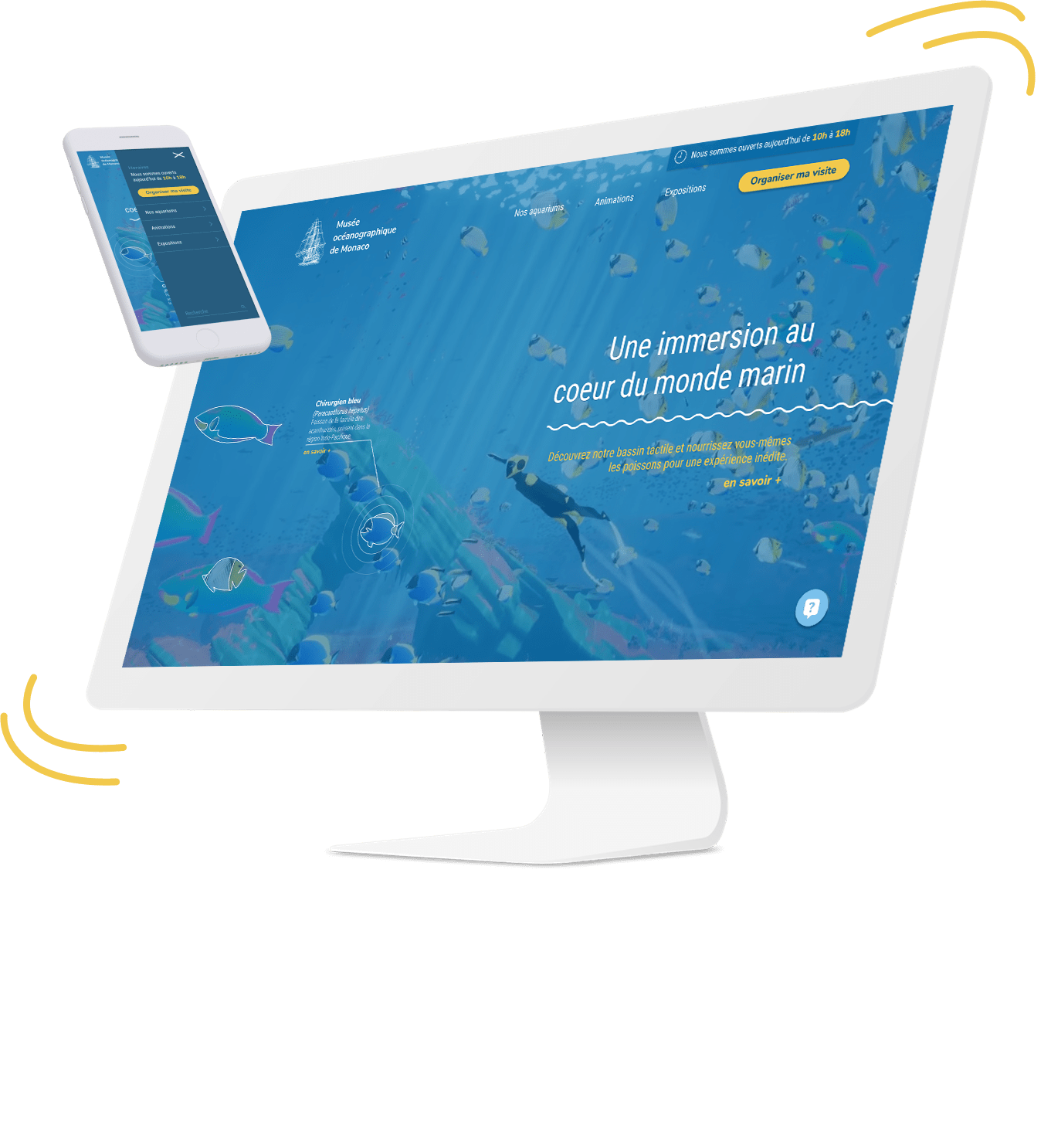
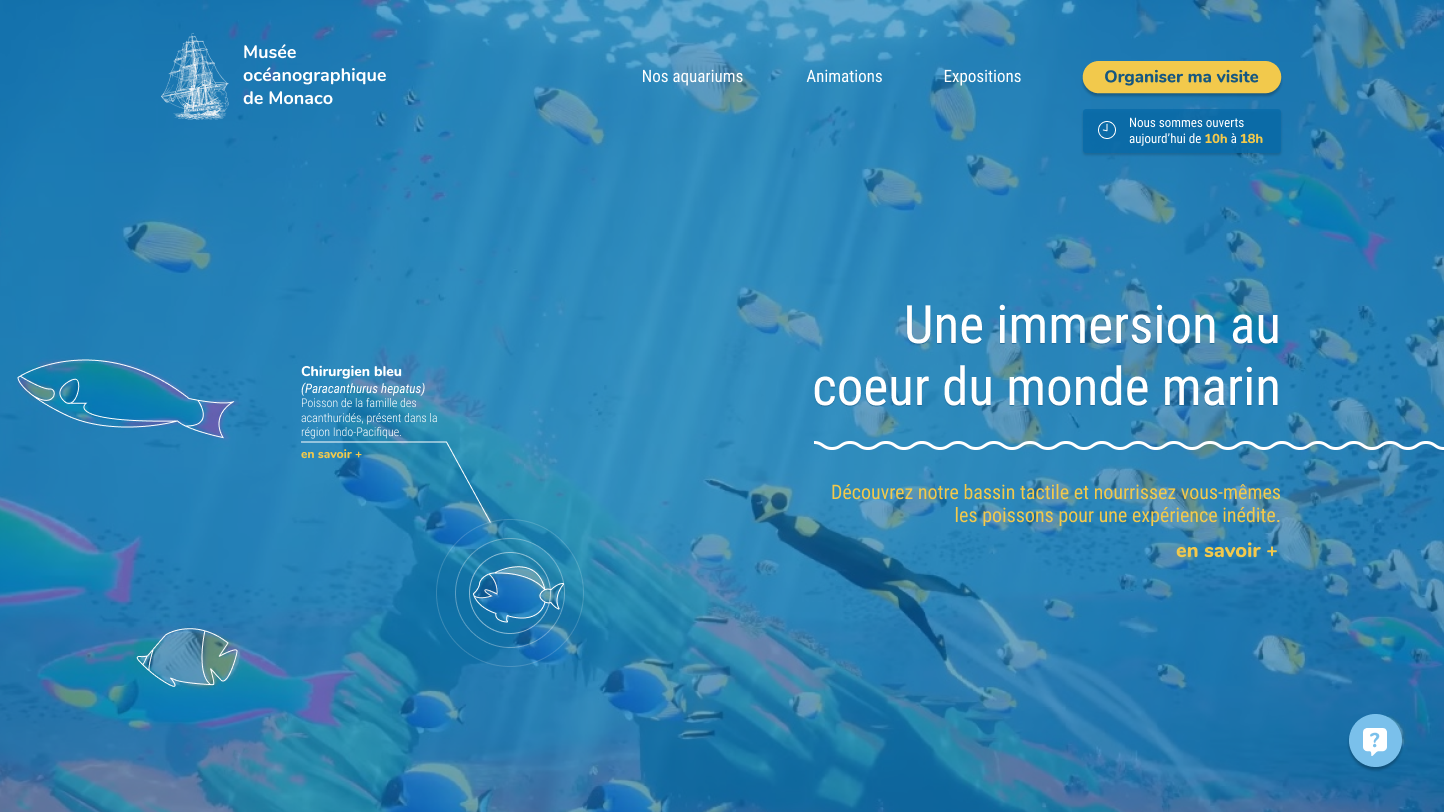
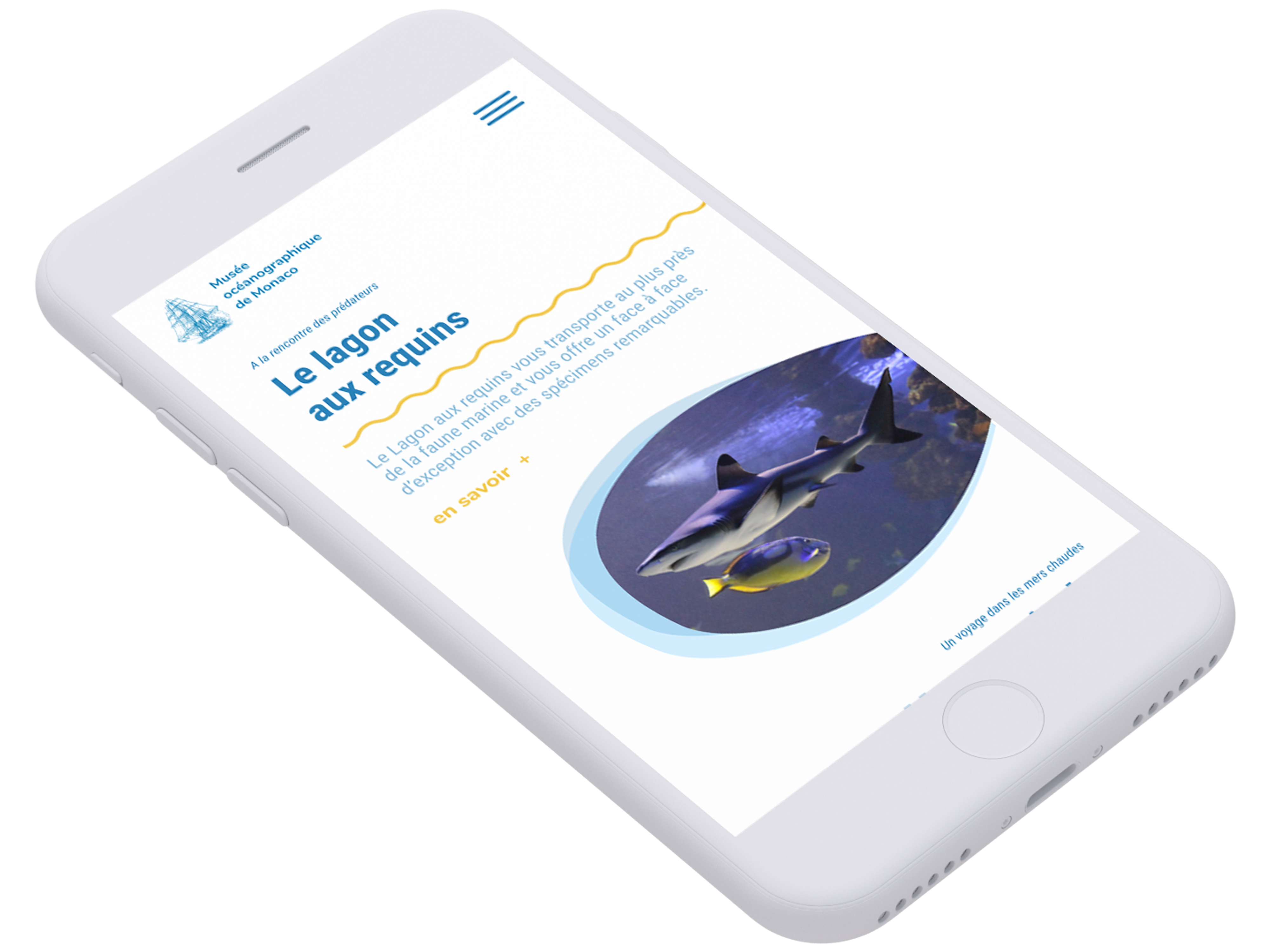
HOMEPAGE
The goal of the new homepage is to immerse the visitor directly into the aquatic world. The user can play around with an interactive aquarium, without being interrupted by useless information coming from every corner of the screen.
He can directly access the main functionnality and doesn't spend too much time scanning the page. This homepage will arouse the curiosity of the visitors, especially children.
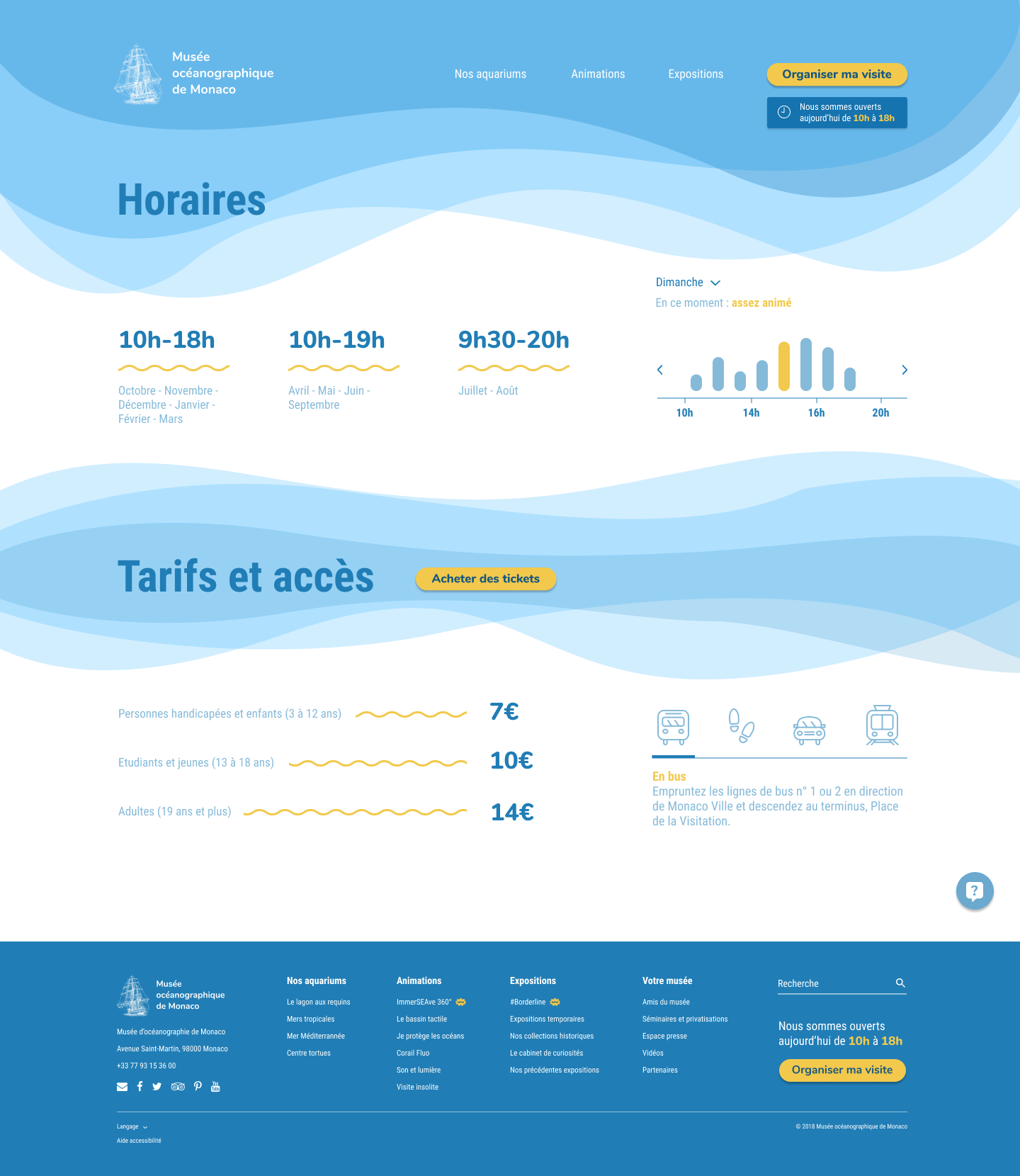
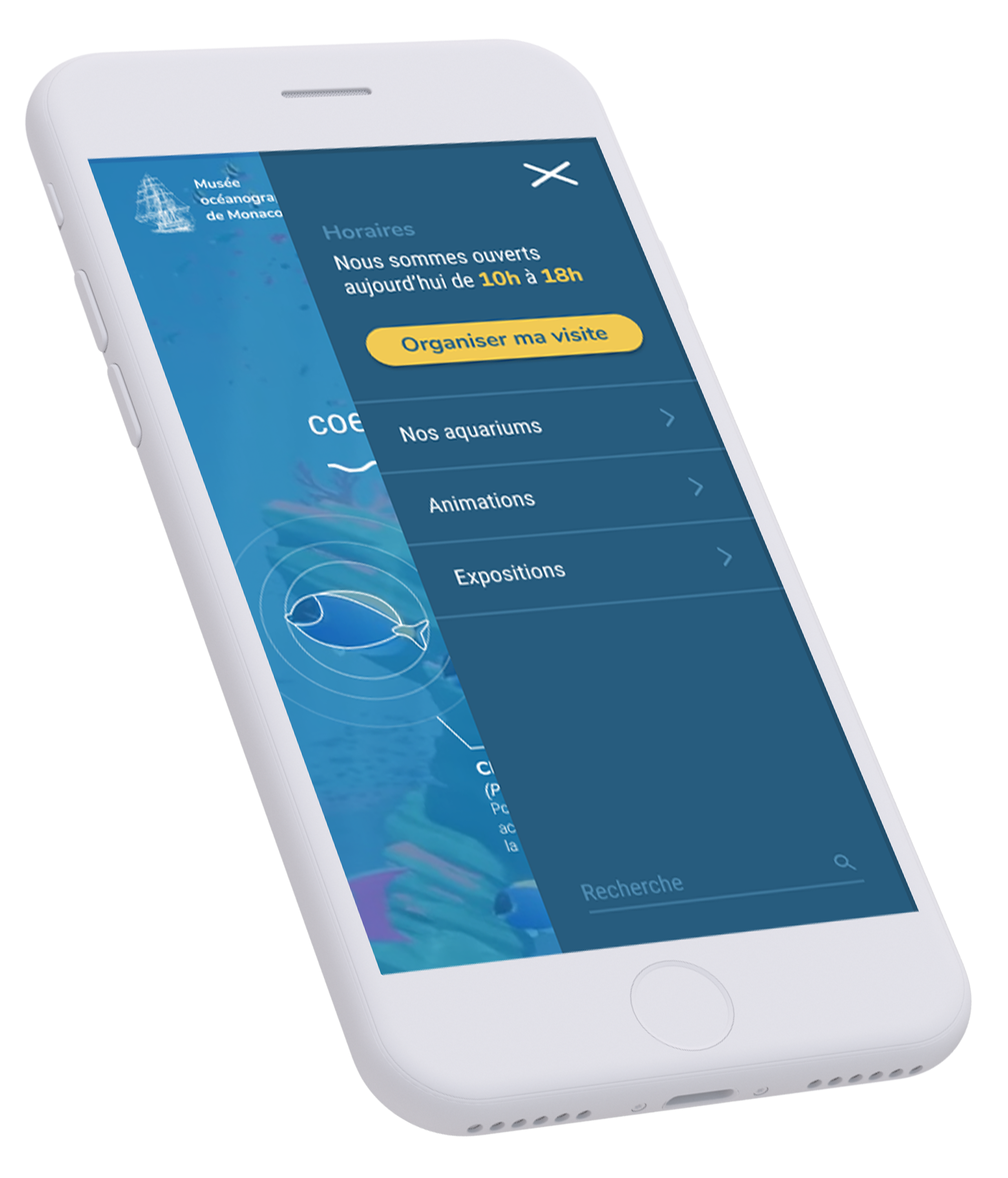
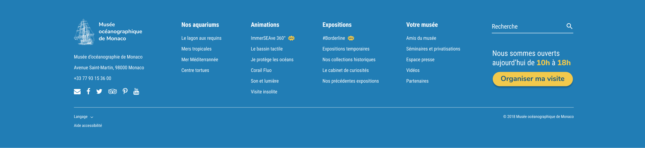
OTHER PAGES
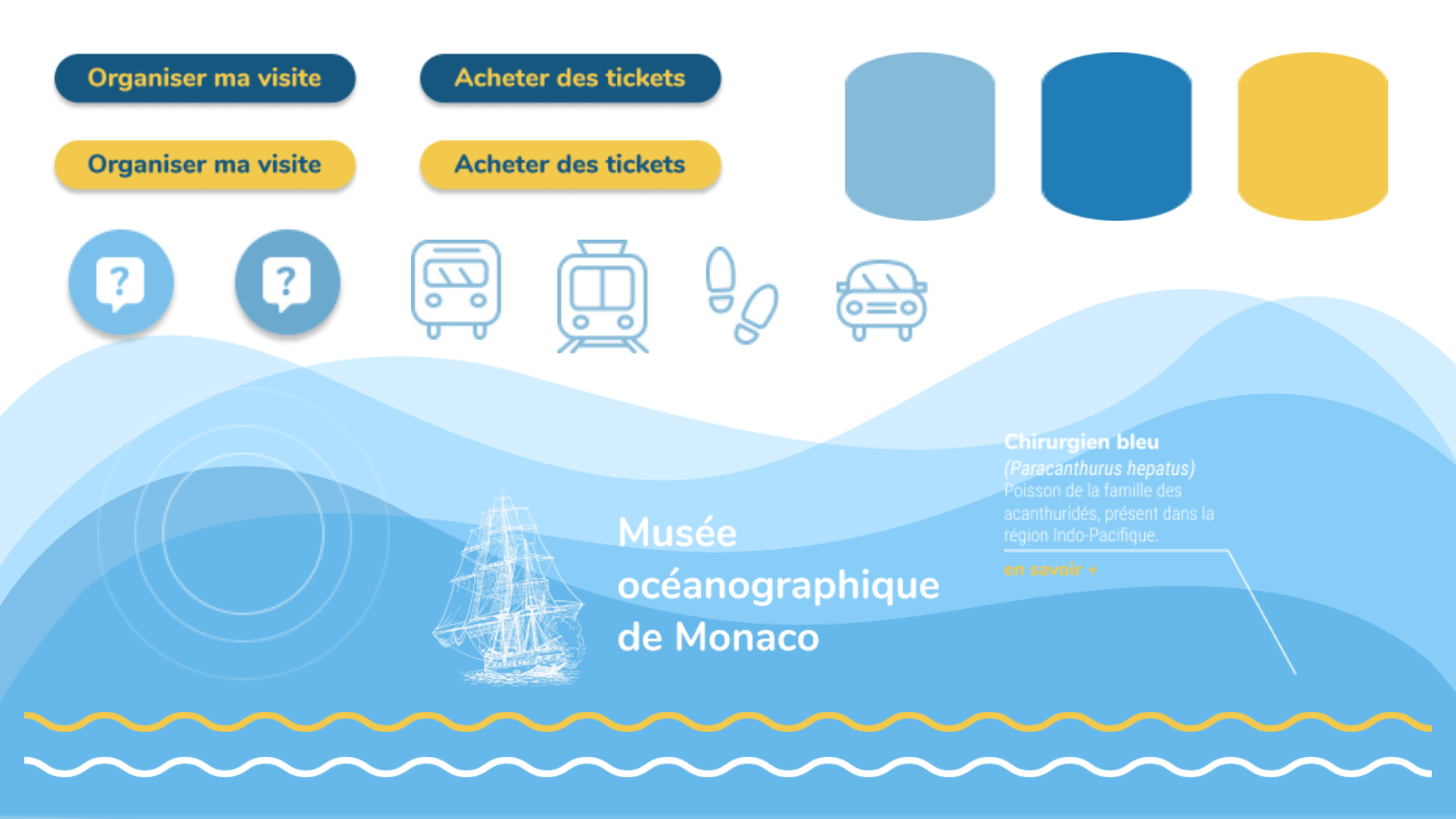
I've designed other interfaces, including the page presenting all the different aquariums, the visit organization page, as well as the ticketing page and their mobile versions. I've also created a simplified graphic charter that would suit the aquarium's identity.
Want to see more ?
If you want to see a more detailed version of our presentation to the teachers/clients, here is the link of the full Google Slides file [FR] .